Graphic Design Is My Passion: A Guide to Good Design
You know that feeling when you’re looking closely at something — maybe an object, a piece of packaging, a promotional flyer, or even a meme — and it “just doesn’t look right”? What you’re feeling in that moment isn’t just a gut reaction or a matter of personal taste; it’s the principles of design quietly doing (or maybe not doing) its work backstage. This guide to good design is for when “graphic design is my passion” stops being a joke and starts becoming a plan.
Good design does more than look polished; it directs attention, clarifies information, and nudges people to take action. Whether you’re shaping a brand, building a website, posting on socials, or publishing a report, design principles give you a toolkit for creating work that is clear, engaging, and effective. In this article, we’ll walk you through the basics of good design.
Your Guide to Good Graphic Design Principles
What Are the Principles of Design?
Line, shape, color, texture, space, form, and type make up the elements of design, and a handful of principles guide designers to make those elements work together rather than fight for attention. Designers might rely on these principles to plan a layout, create visual hierarchy, or emphasize certain elements. Together, graphic design elements and principles balance creative expression and purpose so that visuals can be used to communicate, not just decorate.
These design principles are balance and alignment, contrast, emphasis, proximity, repetition, white space, and hierarchy. A long history underlies these principles, which have remained relatively unchanged over time, even as art and design evolved alongside technology. As design moved into screens, motion, and interaction, the principles adapted to include responsiveness, feedback, and user behavior, but the main goal stayed the same: make messages understandable and memorable.

Key Principles of Design Explained
When you combine the elements of design with the principles below — whether in posters, user interfaces, or packaging — you get results that aren’t just pretty; they’re purposeful.
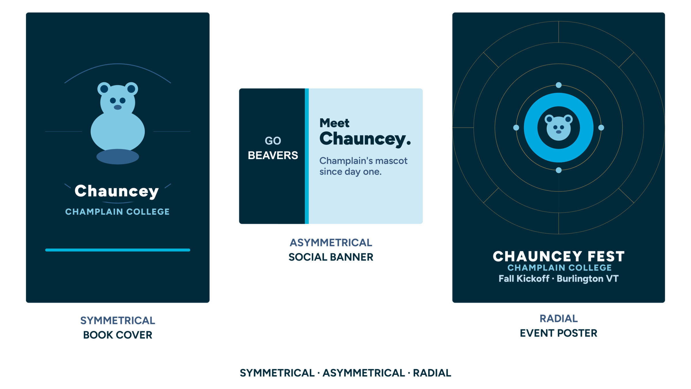
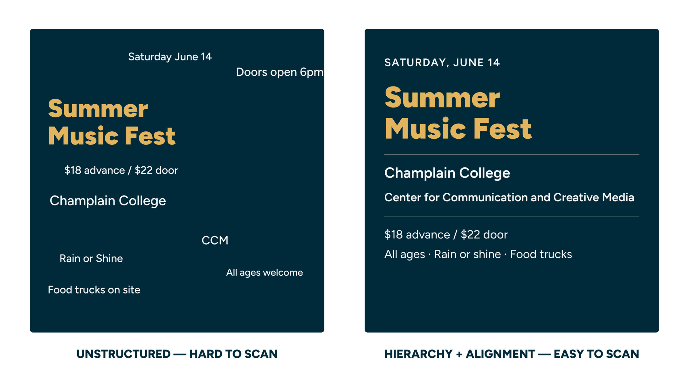
Balance and Alignment
Just as physical balance distributes weight to create stability, graphic design balance distributes visual weight to level out what we see, where we see it, and when we see it. This is known as alignment, the positioning of specific elements along shared edges or centers. It helps prevent visual drift and makes scanning easier. Think of the text in a book: it’s usually aligned to the left to help guide our reading, but what if it were aligned to the right? It would be pretty hard to read, right?
- Symmetrical: Elements (remember: color, shape, line, etc.) mirror each other across a central axis, producing a balanced, orderly feel.
- Asymmetrical: Different elements achieve balance using contrast in size, value, or placement for energy and interest.
- Radial: Elements radiate from a center point, guiding attention inward or outward.
Pro Tip: Not sure which one to go with in a design? Try matching the balance to the tone of what you’re communicating with this design: symmetrical for tradition and structure, asymmetrical for dynamism, and radial for strong focal points.
Contrast
Contrast helps the eye separate what’s important from the background and guides the viewer’s attention. You can build contrast through size, color, value, shape, texture, and font style. The most effective contrast pairs opposites — big and small, bold and subtle, warm and cool — but the key is keeping it consistent so the design feels intentional rather than chaotic.
- High contrast draws attention and improves readability (think dark text on a light background).
- Low contrast supports harmony and subtlety (use carefully so legibility stays strong).
Emphasis
Emphasis tells the viewer where to look first. It supports a design’s focal point and helps establish a clear visual hierarchy. By using scale, color, white space, or motion, you can draw attention to key information, like a headline or a call-to-action button. Emphasis works best with a clear hierarchy that guides the viewer’s eye from one element to another.
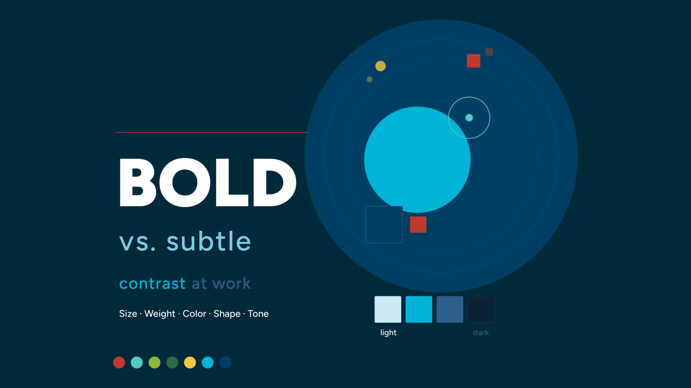
In this example, what you notice first is the word “BOLD,” which stands out in bright white against a dark background. That’s the main message the designer wants you to take away. Everything else is either secondary (the circular designs) or tertiary (the various color swatches).
Pro Tip: Too many competing focal points cancel each other out.
Proximity
Proximity is the principle that physical distance between the things you see in a design signals their relationship to one another. For example, take the text you’re reading right now — it’s clear this paragraph belongs to the heading above it because of how closely they’re positioned together. Tight spacing between a headline and its body text shows that they’re connected; extra space between sections tells the viewer that a new idea is beginning. This is the purpose of proximity, which helps users find labels, buttons, and form fields online without having to hunt for them.
Repetition
Repetition turns one-off design choices into a recognizable visual identity, making multi-page documents, dashboards, and campaigns feel unified instead of pieced together. Most brands stick to the same colors, type styles, icons, or patterns to build consistency and recognition. It also provides direction. On a website, for example, buttons may always look the same across every webpage to help signal what action they want the user to take. When headings follow a predictable style, readers can skim with confidence.
White Space
It’s always best to give elements room to breathe, improving clarity and focus; empty space is an important design element. Margins, padding, and line spacing create visual “rests” that prevent fatigue and overwhelm. On a crowded screen, increasing white space around key actions can boost clicks more effectively than adding more color or decoration.
Hierarchy
Hierarchy gives design a sense of order. It ranks content so users can scan from most important to details — often using size, weight, and placement. Clear hierarchy answers “Where do I start?” and “What matters most?” at a glance. In practice, that might mean one dominant headline, supporting subheadings that organize content, and smaller body text, all working together on the same grid and reinforced by consistent proximity and repetition.
Applying the Principles in Real Projects
As tempting as it may be to jump right in and select a color palette, type style, or image for any given design, you should start by answering a simple question: What do you want someone to notice or do first? From there, you can work your way through the principles outlined above to help you achieve your objective.
You might start by using emphasis to highlight a main action, contrast to separate sections, and alignment to bring structure. Then you refine it. If the main action is getting lost because of contrast, consider using proximity to help separate your sections instead. Once you’ve got an idea of how you’ll accomplish your goal, experiment with color, type, or other design elements.
Consider these Scenarios
Imagine you’re tasked with designing four very different projects: a landing page for a non-profit, a magazine feature, a dashboard for an app, and a style guide or worksheet. What might the goal for each of those pieces be? How would you achieve that? What principles and elements would work best for each piece? Here’s how the principles we’ve learned might come into play for each:
- Nonprofit landing page: The goal here is to inspire action, specifically donations. An asymmetrical layout places a bold donation panel on one side, balanced by supporting stories and images on the other. A high-contrast donate button stands out, while consistent alignment and spacing guide the eye’s scan path.
- Magazine feature: You need to draw readers in and keep them engaged. A large opener image and strong headline set emphasis, followed by clear type hierarchy: deck, subheads, and body copy. White space around pull quotes creates pauses that invite reading.
- Software dashboard: The best software dashboards are clean, clear, and efficient. Alignment and proximity structure data into clusters. Contrast highlights anomalies and alerts. Consistent icon styles and colors create recognition at a glance.
- Study guide or worksheet: The goal here is to make information easy to read and follow. Ample white space reduces cognitive load. Clear headings, subheads, and bullet lists help you navigate complex topics quickly.
Practical Design Tips:
- Lock in your text hierarchy by creating a typographic scale for headings, subheads, and body copy.
- Adopt a grid and stick to it so alignment becomes automatic.
- Test color contrast to ensure readability and meet accessibility standards.
- Reserve one special accent color for main actions and highlights.
- Prototype early and review in grayscale to validate contrast and hierarchy before committing to color.
How Design Principles Improve Communication
Here’s the thing about design principles: they aren’t just rules for making things look good. They’re tools for making things work. When hierarchy and emphasis are clear, readers know exactly where to look and what to do. When contrast is strong, the message still reads clearly on a small phone screen in bright sunlight. When alignment and proximity are consistent, people navigate a page with ease.
This is why design shows up everywhere once you start looking. The layout of a cereal box. The way a hospital uses color to help patients find the right floor. The reason a “buy now” button is almost always a different color than everything else on the page. None of that is accidental. Someone made an intentional decision using the same principles you just read about.
Brands depend on these fundamentals too. When a company repeats the same colors, type styles, and spacing across its website, packaging, social media, and signage, it creates a feeling of reliability — even if you can’t explain why. That consistency is designed. So is the energy of a bold, high-contrast concert poster, and the calm of a luxury spa’s all-white brochure. The principles are the same. The choices are different. And that gap — between knowing the rules and knowing when to use them, bend them, or break them — is where your own design voice starts to develop.
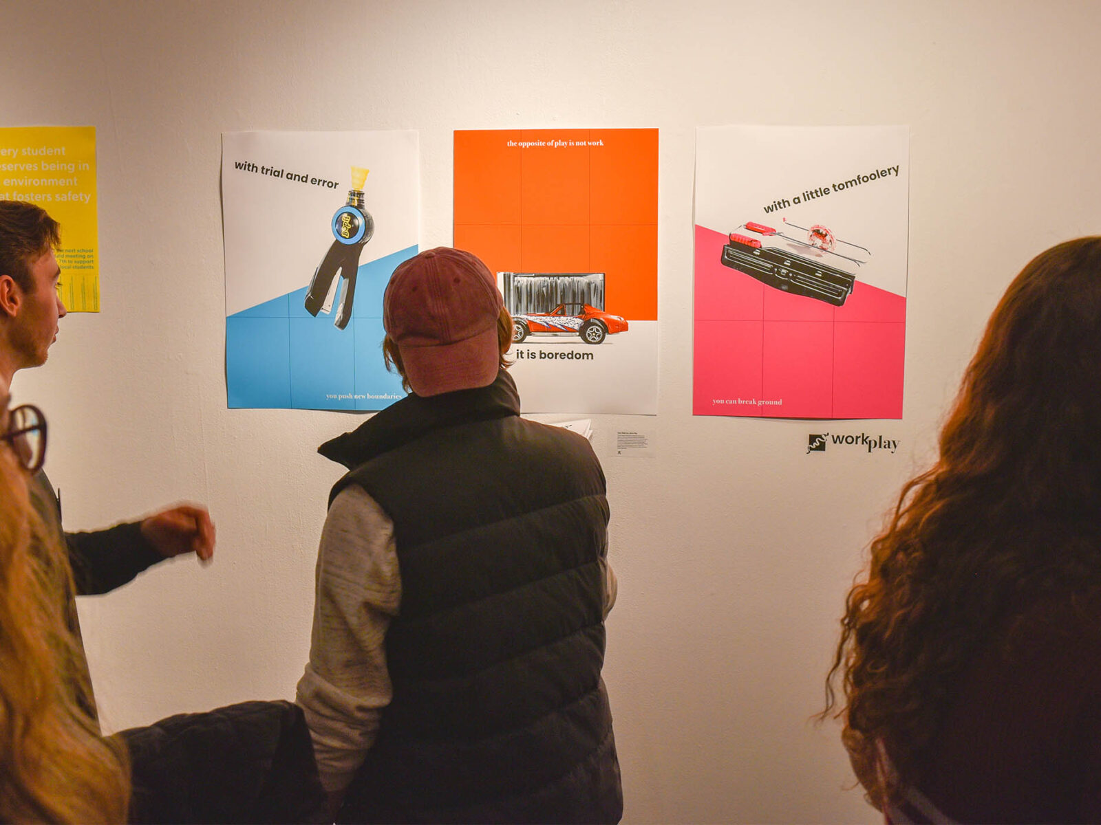
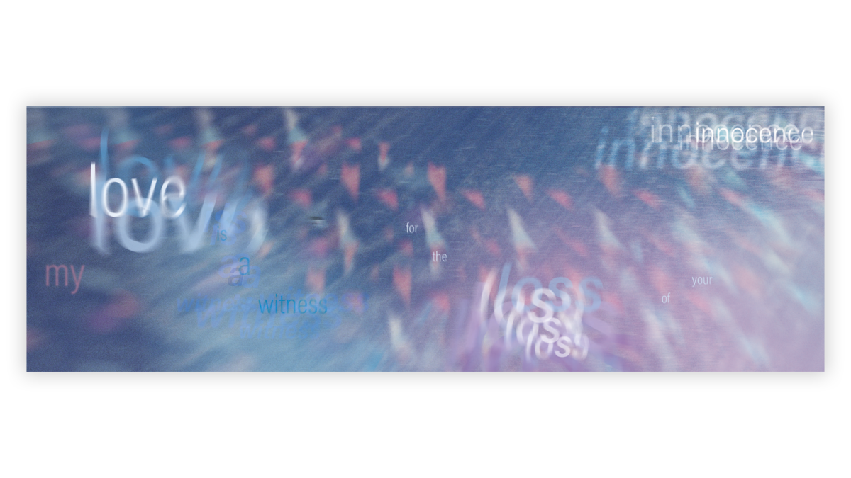
Check out some student work!

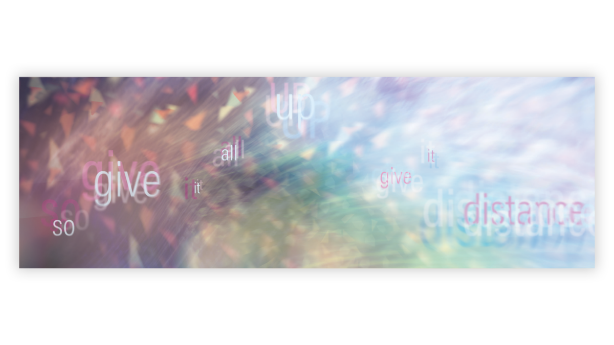
(This is) the Thing – Typographic Exercise
A typographic exercise conducted by Maeve McGuinness, inspired by the song, (This Is) The Thing by Angelo De Augustine and Sufjan Stevens.

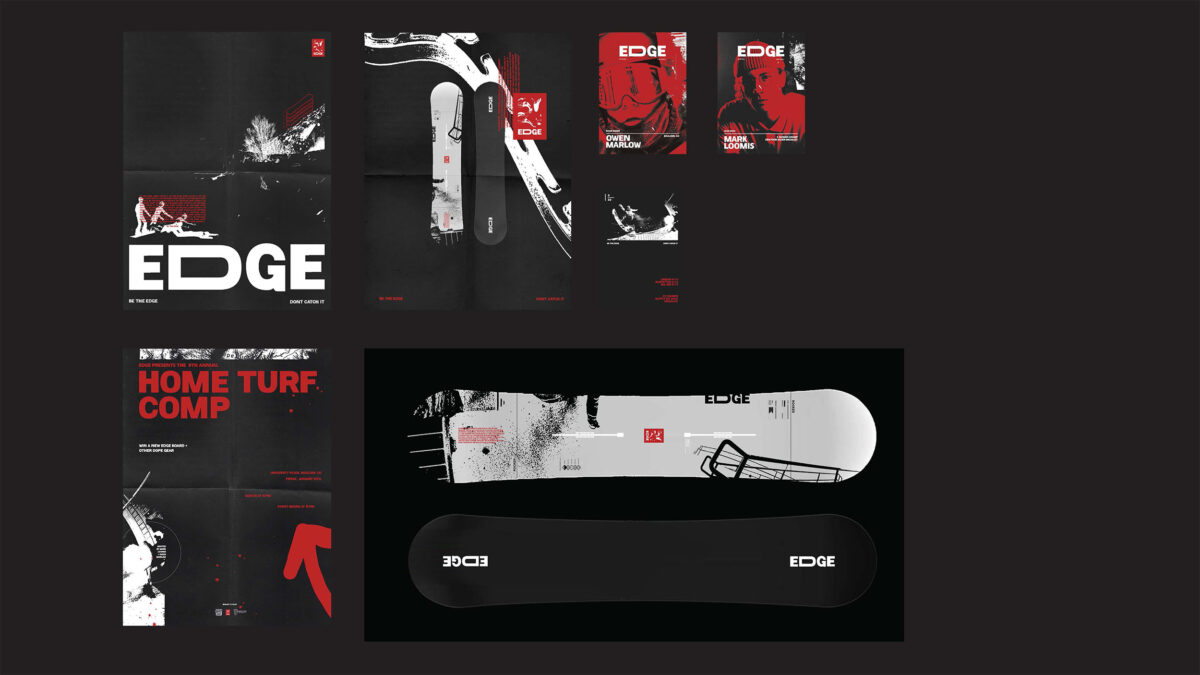
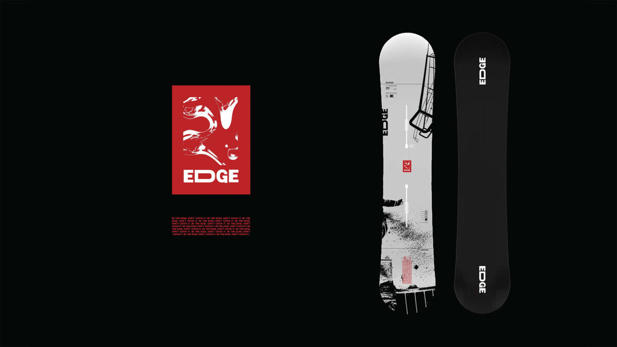
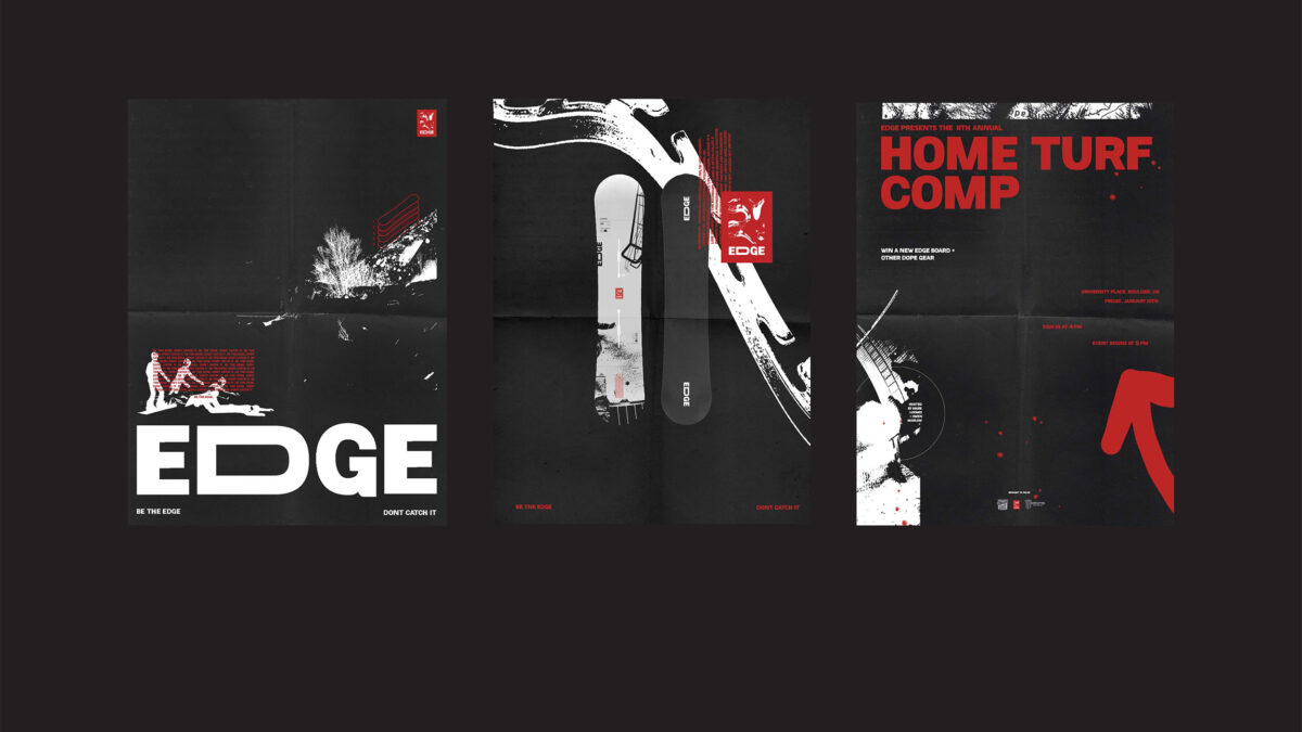
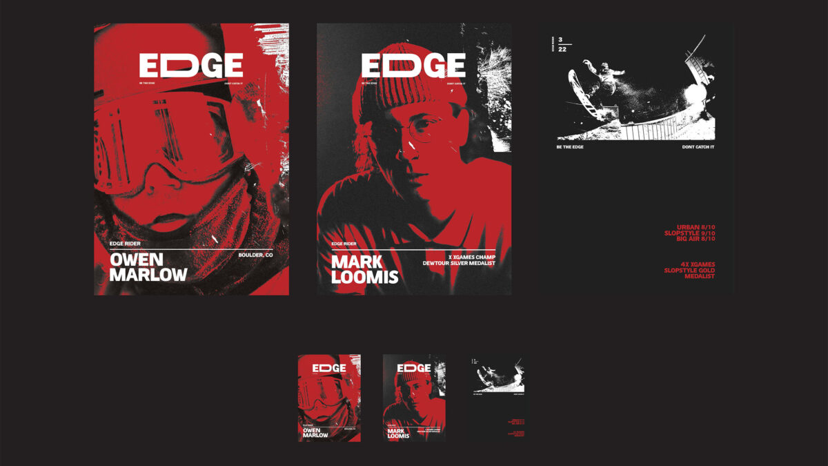
Edge Snowboards – Brand Collateral
A series of graphics created by Hannah Rein for a theoretical snowboard lifestyle brand.
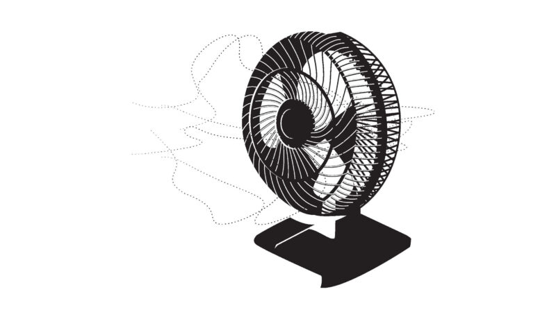
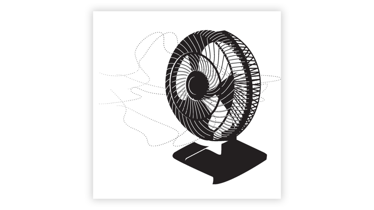
Table Fan – Digital Illustration
A detailed black and white digital illustration of a table fan, created by Parker Derrick.
From Instinct to Skill: What it Looks Like to Actually Learn Design
Reading about design principles is a starting point. But the real shift happens when you start making things, getting feedback, and making them again.
That process — called a critique — is at the heart of how designers actually learn. You put your work up, someone points out that the hierarchy is confusing or the contrast isn’t pulling the eye where it should, and suddenly, you see it too. Then you fix it. Over time, you stop needing someone else to point it out. You start catching it yourself, earlier and earlier in the process. That’s what it means to develop an eye.
It’s also how you figure out what kind of designer you are. Some people gravitate toward clean, minimalist layouts. Others are drawn to expressive typography or rich, layered color. Neither is right nor wrong, but you only discover your instincts by creating a lot of work and having honest conversations about it.
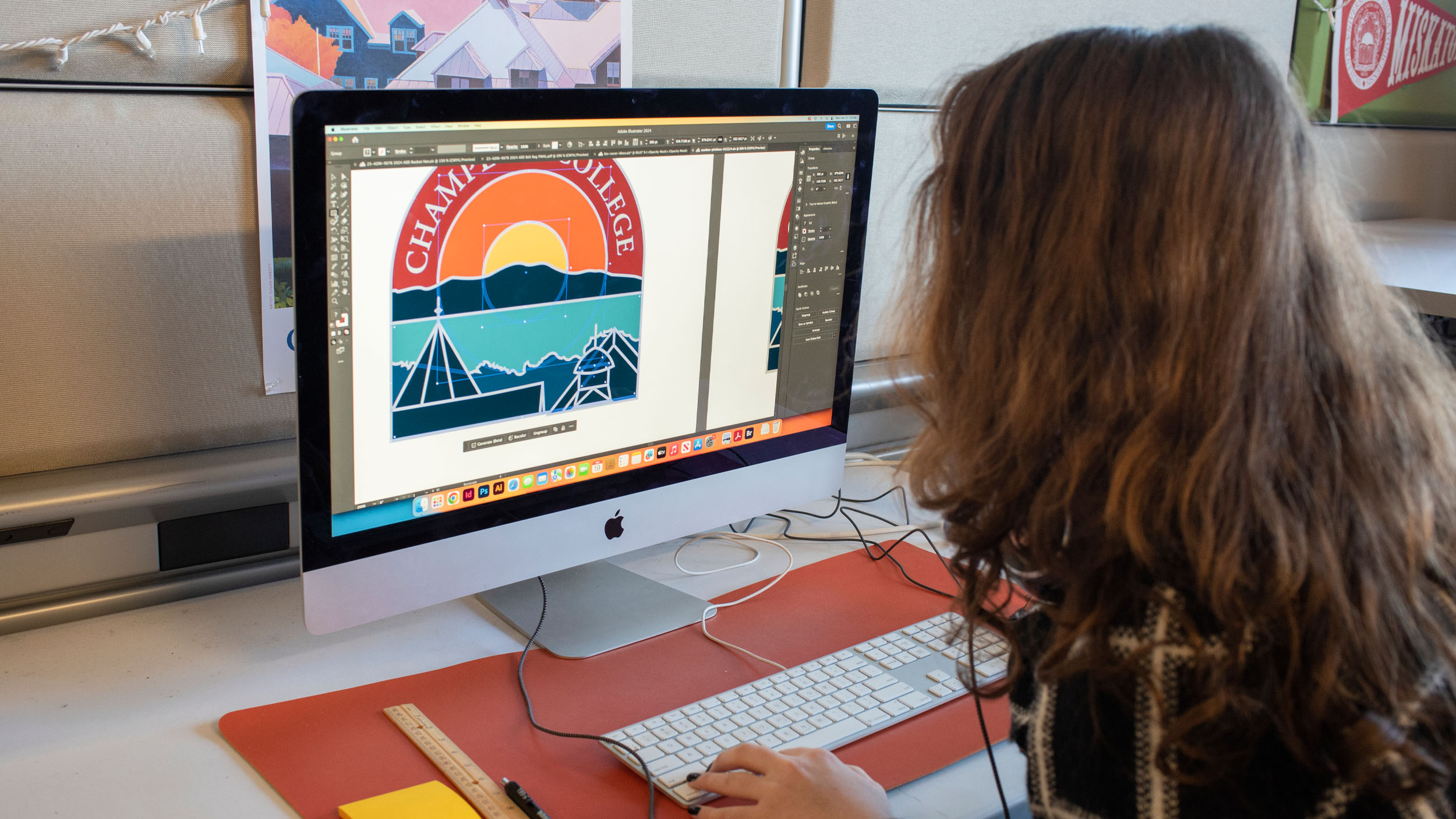
Choosing a hands-on BA or BFA degree in graphic design is an ideal first step for aspiring designers. At Champlain College, the Graphic Design programs are built around hands-on studio sessions, focused on making and critiquing, not just listening to lectures. As a career-focused institution, students aren’t just making hypothetical projects: they’re working with real clients, building real portfolios, and developing real professional habits from true working designers.
By the time Graphic Design students graduate, they’re not just well-versed in what contrast means or proximity means, and when to use them. They’re designers who use them in their own artistic way; who use them to support brand identity; who understand how to apply them to product packaging rather than a UX prototype; and who can talk about the choices they make and why.

Where Can Design Take You?
Graphic design is one of those fields where the job titles barely scratch the surface of what’s possible. Graduates go on to work as brand designers, UX and UI designers, motion graphics artists, art directors, packaging designers, illustrators, web designers, creative directors, and more. Some work at agencies. Some go in-house at companies they love. Some freelance. Some start their own studios.
What they have in common is the ability to look at the world and see it as designed, and to imagine how it could be designed differently. That’s not a skill you’re born with. It’s one you build.
Frequently Asked Questions
What’s the difference between the elements and principles of design?
Elements are your raw materials: line, shape, color, texture, space, form, and type. Principles are the guidelines for putting them together effectively — balance, contrast, emphasis, alignment, proximity, repetition, white space, and hierarchy. Elements are what you have. Principles are how you use them.
Which principle should I focus on first?
Start with hierarchy. Ask yourself: what’s the most important thing on this page? Make sure it looks the most important — through size, weight, or placement. Everything else should support it, not compete with it.
Can I learn design on my own, or do I need to study it formally?
You can absolutely start on your own — and you should. Try redesigning a flyer, mock up a logo for a club, or recreate a poster you love. But there’s a ceiling to self-teaching that formal study breaks through. Critique, community, and access to expert feedback accelerate your growth in ways that YouTube tutorials don’t. The difference between a self-taught designer and a trained one usually shows up in the decisions they can’t quite explain yet.
Do these principles apply to digital design too, or just print?
All of it: websites, apps, social graphics, motion graphics, environmental signage, packaging. The medium changes; the principles don’t.
Putting It All Together
The principles of design are not a checklist. They’re a way of seeing. Once you’ve absorbed them, you start noticing the hierarchy in a restaurant menu, the contrast in a movie poster, the proximity in a well-designed form. Design really is everywhere — and the more fluent you become in its language, the more clearly you can read it, and the more intentionally you can speak it.
At Champlain College, the BA in Graphic Design and BFA in Graphic Design & Visual Communication programs are built for exactly that kind of curious, visually awake person. You’ll learn the principles. You’ll practice them on real projects with real clients. You’ll develop your own design voice through critique and experimentation. And you’ll graduate with a portfolio that shows — not just tells — what you can do.
Looking for more information about Champlain College? Start here!
Fill out the form to receive helpful information!
All trademarks, service marks, trade names, and logos referenced in this article are the property of their respective owners. All company, product, and service names used in this article are for identification purposes only.
Author


More Inside The View
Ideas
From the minds of our students, faculty, and alumni.
News
The latest from Champlain College.
People
Champlain is more than just a place; it's a community.
Places
On campus, in Burlington, and beyond.
Events
Check out our many campus events and get involved! Refine your search by using the filters or monthly view options.